Getting Started
Album and Image Gallery Plus Lightbox Pro adds a Menu tab in WP Admin side with the name “Album Gallery Pro” where you can add new Image Gallery, Albums and etc, edit and delete.
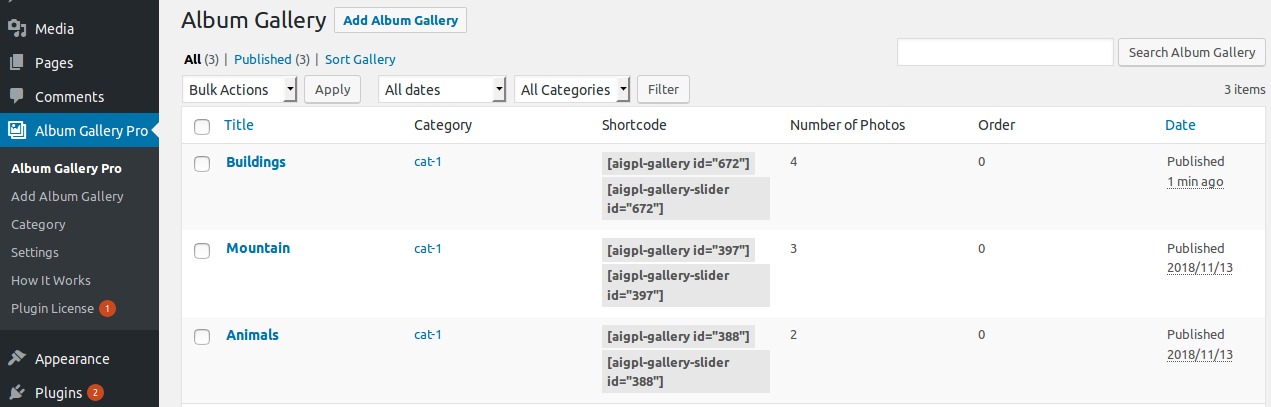
Screen shows “Album Gallery Pro” tab in the left side and All Image Gallery added
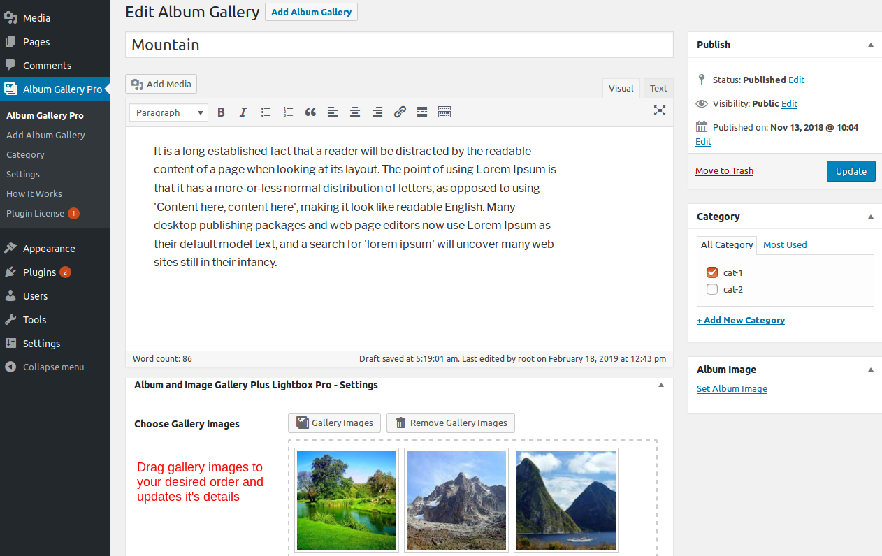
This plugin work same like WordPress post section where you can add title and featured image as album image. To add a new Image Gallery in plugin just need to follow few steps.
- Go to Album Gallery Pro Tab and click on Add New
- Add Album title, Add Album description, Add Gallery Images, Add Gallery Title, Add Gallery description and update
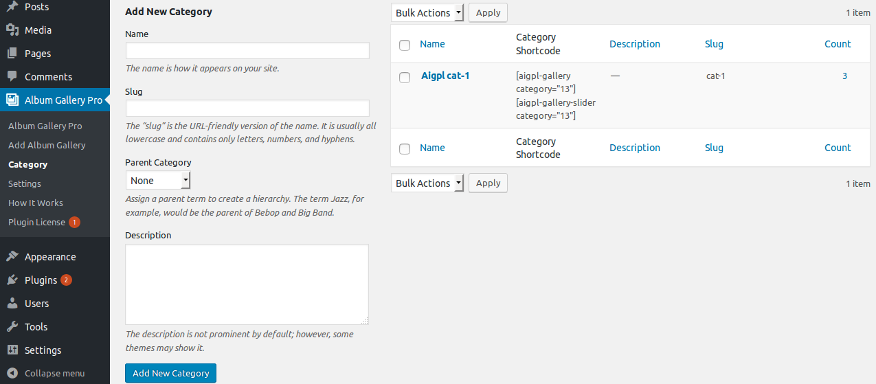
- If you want to display category wise then go to Album Gallery Pro -> Category and create a category
- When you create a Album Gallery post, select the category for that post
Bellow screen shows how to add a Album Gallery
If you want to display category wise then go to Album Gallery Pro -> Category and select the shortcode.
Bellow screen show category shortcode
How to Display and Shortcode
The plugin contains four shortcode.
[aigpl-gallery]
[aigpl-gallery-slider]
[aigpl-gallery-album]
[aigpl-gallery-album-slider]
<?php echo do_shortcode('[aigpl-gallery]'); ?> <?php echo do_shortcode('[aigpl-gallery-slider]'); ?> <?php echo do_shortcode('[aigpl-gallery-album]'); ?> <?php echo do_shortcode('[aigpl-gallery-album-slider]'); ?> Parameters for Gallery Grid
-
Gallery ID:
[aigpl-gallery id="5,9"]
Display Gallery images by specific ID. You can pass multiple ids by comma separated. -
Grid:
[aigpl-gallery grid="1"]
Display gallery image in column or grid wise. -
Design:
[aigpl-gallery design="design-1"]
Select design for image gallery. -
Link Target:
[aigpl-gallery link_target="self"]
Open a link in new tab or not. Values are “self” OR “blank”. -
Offset:
[aigpl-gallery offset="5"]
This will hide first five post. E.g I have set offset 5 then it will skip first five post.
Note: This will not work with limit=”-1″. -
Gallery Height:
[aigpl-gallery gallery_height="400"]
Set Gallery height. You can enter any numeric number. You can set “auto” for auto height. -
Display Title:
[aigpl-gallery show_title="true"]
Display image title. Values are “true” OR “false”. -
Display Description:
[aigpl-gallery show_description="true"]
Display image description. Values are “true” OR “false”. -
Display Caption:
[aigpl-gallery show_caption="true"]
Display image caption. Values are “true” OR “false”. -
Image Size:
[aigpl-gallery image_size="full"]
Set image size. Values are “full”, “medium”, “large” OR “thumbnail”. -
Popup:
[aigpl-gallery popup="true"]
Open gallery image in a popup. Values are “true” OR “false”. -
Masonry:
[aigpl-gallery masonry="true"]
Display gallery images in a masonry layout. Values are “true” OR “false”. -
Extra Class :
[aigpl-gallery-album extra_class=""]
Enter extra class.
Note: Extra class added as parent so using extra class you customize your design.
Parameters for Gallery Slider
-
Gallery ID:
[aigpl-gallery-slider id="5,9"]
Display Gallery slider images by specific id. You can pass multiple ids by comma separated. -
Design:
[aigpl-gallery-slider design="design-1"]
Select design for image gallery slider. -
Link Target:
[aigpl-gallery-slider link_target="self"]
You can open a link in new tab or not. Values are “self” OR “blank”. -
Gallery Height:
[aigpl-gallery-slider gallery_height="400"]
Set gallery image height for slider. You can set “auto” for auto height. -
Display Title:
[aigpl-gallery-slider show_title="true"]
Display image title for slider. Values are “true” OR “false”. -
Display Description:
[aigpl-gallery-slider show_description="true"]
Display image description for slider. Values are “true” OR “false”. -
Display Caption:
[aigpl-gallery-slider show_caption="true"]
Display image caption for slider. Values are “true” OR “false”. -
Image Size:
[aigpl-gallery-slider image_size="full"]
Set Image Size. Values are “full”, “medium”, “large” OR “thumbnail”. -
Popup:
[aigpl-gallery-slider popup="true"]
Open gallery image in a popup. Values are “true” OR “false”. -
Slides Columns:
[aigpl-gallery-slider slidestoshow="2"]
Display gallery image in column or grid view. -
Slides To Scroll:
[aigpl-gallery-slider slidestoscroll="2"]
Scroll number of images at a time. -
Loop:
[aigpl-gallery-slider loop="true"]
Run Gallery slider continuously. Values are “true” OR “false”. -
Slider Dots and Arrows:
[aigpl-gallery-slider dots="false" arrows="false"]
Display slider arrows and dots. Values are “true” OR “false”. -
Autoplay:
[aigpl-gallery-slider autoplay="true"]
Start slider automatically. Values are “true” OR “false”. -
Autoplay Interval:
[aigpl-gallery-slider autoplay_interval="3000"]
Delay between two slides. -
Slider Speed:
[aigpl-gallery-slider speed="3000"]
Set slider speed. -
Center Mode:
[aigpl-gallery-slider centermode="true"]
Set Slider center mode effect. Values are “true” OR “false”. -
Hover Pause
[aigpl-gallery-slider hover_pause="true"]
Pause slider autoplay on hover. Values are “true” OR “false”. -
Focus Pause
[aigpl-gallery-slider focus_pause="false"]
Pause slider autoplay when slider element is focused. Values are “true” OR “false”. -
Extra Class :
[aigpl-gallery-slider extra_class=""]
Enter extra class.
Note: Extra class added as parent so using extra class you customize your design.
Parameters for Gallery Album Grid
-
Limit:
[aigpl-gallery-album limit="15"]
Display number of Gallery Album. You can display all albums by limit=”-1″. -
Album Design:
[aigpl-gallery-album album_design="design-1"]
Select design for album. -
Album Popup:
[aigpl-gallery-album album_popup="true"]
Open albums image in popup. Values are “true” OR ” false”. -
Album Masonry:
[aigpl-gallery-album album_masonry="true"]
Display albums in masonry view. Values are “true” OR “false”. -
Album Grid:
[aigpl-gallery-album album_grid="3"]
Display album in column or grid view. -
Album Link Target:
[aigpl-gallery-album album_link_target="self"]
Open album link in same tab or new tab. Values are “self” OR “blank”. -
Album Height:
[aigpl-gallery-album album_height="400"]
Set album image height. -
Album Title:
[aigpl-gallery-album album_title="true"]
Display album title. Values are “true” or “false”. -
Album Description:
[aigpl-gallery-album album_description="true"]
Display album description. Values are “true” or “false”. -
Album Full Content:
[aigpl-gallery-album album_full_content="true"]
Display album full description. Values are “true” or “false”. -
Content Words Limit:
[aigpl-gallery-album words_limit="40"]
Display number of words for album description. -
Content Tail (Continue Reading):
[aigpl-gallery-album content_tail="…"]
Display three dots as a continuous reading. -
Display Specific Album:
[aigpl-gallery-album id="5,10"]
Display specific album. You can pass multiple ids by comma separated. -
Exclude Specific Album:
[aigpl-gallery-album exclude_post="5,10"]
Exclude specific album which you do not want to display. You can pass multiple ids by comma separated. -
Display Child Category:
[aigpl-gallery-album include_cat_child="true"]
Display child category. Values are “true” and “false”. -
Display By Category:
[aigpl-gallery-album category="20,30,40"]
Display album by their category ID. You can pass multiple ids by comma separated. -
Exclude Category:
[aigpl-gallery-album exclude_cat="5,10"]
Exclude specific album category which you do not want to display. You can pass multiple ids by comma separated. -
Order:
[aigpl-gallery-album order="DESC"]
Set album order. Values are “ASC” OR “DESC”. -
Order By:
[aigpl-gallery-album orderby="date"]
Display album order wise. You can display “date” (Album Date), “modified” (Album updated date), “title” (Album Title), “rand” (Random), “menu_order” (Custom Order). -
Pagination:
[aigpl-gallery-album pagination="true"]
Enable album pagination or not. Values are “true” OR “false”. -
Pagination Type:
[aigpl-gallery-album pagination_type="numeric"]
Pagination type works when pagination set to true. Values are “prev-next” OR “numeric”. -
Album Offset:
[aigpl-gallery-album offset="5"]
This will hide first five post. E.g I have set offset 5 then it will skip first five post.
Note: This will not work with limit=”-1″. -
Total Photo Label:
[aigpl-gallery-album total_photo="{total} Photos"]
Control photo count label. “{total}” will replace the number of album photos. -
Image Popup:
[aigpl-gallery-album popup="true"]
Open gallery image in a popup. Values are “true” OR “false”. -
Image Grid:
[aigpl-gallery-album grid="1"]
Display gallery images in columns or grid view. -
Image Height:
[aigpl-gallery-album gallery_height="400"]
Set image height. You can set “auto” for auto height. -
Gallery Design:
[aigpl-gallery-album design="design-1"]
Select design for image gallery. We have provided 12 designs. -
Display Image Caption:
[aigpl-gallery-album show_caption="true"]
Display image caption. Values are “true” OR “false”. -
Image Link Behaviour:
[aigpl-gallery-album link_target="self"]
Open a image link in new tab or same tab. Values are “self” OR “blank”. -
Display Image Title:
[aigpl-gallery-album show_title="true"]
Display image title or not. Values are “true” OR “false”. -
Display Image Description:
[aigpl-gallery-album show_description="true"]
Display image description. Values are “true” OR “false”. -
Image Size:
[aigpl-gallery-album image_size="full"]
Set gallery image size. Values are “full”, “medium”, “large” OR “thumbnail”. -
Masonry View:
[aigpl-gallery-album masonry="true"]
Display gallery images in a masonry view. Values are “true” OR “false”. -
Image Query Offset:
[aigpl-gallery-album query_offset="5"]
This will hide first five post. E.g I have set offset 5 then it will skip first five post.
Note: This will not work with pagination and limit=”-1″ parameter. -
Extra Class:
[aigpl-gallery-album extra_class=""]
Enter extra class.
Note: Extra class added as parent so using extra class you customize your design.
Parameters for Gallery Album Slider
-
Limit:
[aigpl-gallery-album-slider limit="15"]
Display number of Album Slider. You can see all album by limit=”-1″. -
Album Design:
[aigpl-gallery-album-slider album_design="design-1"]
Select design for album. We have privided 17 designs. -
Album Popup:
[aigpl-gallery-album-slider album_popup="true"]
Open album image in popup. Values are “true” OR “false”. -
Album Link Target:
[aigpl-gallery-album-slider album_link_target="self"]
Open album link in new tab or not. Values are “self” OR “blank”. -
Album Height:
[aigpl-gallery-album-slider album_height="400"]
Set album height for slider. -
Album Title:
[aigpl-gallery-album-slider album_title="true"]
Display album title. Values are “true” or “false”. -
Album Description:
[aigpl-gallery-album-slider album_description="true"]
Display album description. Values are “true” or “false”. -
Album Full Content:
[aigpl-gallery-album-slider album_full_content="true"]
Display album full description. Values are “true” or “false”. -
Slider Columns:
[aigpl-gallery-album-slider album_slidestoshow="2"]
Display album in columns or grid view. -
Slides to Scroll:
[aigpl-gallery-album-slider album_slidestoscroll="2"]
Scroll number of images at a time. -
Loop:
[aigpl-gallery-album-slider album_loop="true"]
Run slider continuously. Values are “true” OR “false”. -
Slider Dots and Arrows:
[aigpl-gallery-album-slider album_dots="false" album_arrows="false"]
Display slider arrows and dots. Values are “true” OR “false”. -
Autoplay:
[aigpl-gallery-album-slider album_autoplay="true"]
Start slider automatically. Values are “true” OR “false”. -
Autoplay Interval:
[aigpl-gallery-album-slider album_autoplay_interval="3000"]
Set slider slide interval time. -
Slider Speed:
[aigpl-gallery-album-slider album_speed="300"]
Set slider speed. -
Center Mode:
[aigpl-gallery-album-slider album_centermode="true"]
Set Slider center mode effect. Values are “true” OR “false”. -
Content Words Limit:
[aigpl-gallery-album-slider words_limit="40"]
Display number of words for album description. -
Content Tail (Continue Reading):
[aigpl-gallery-album-slider content_tail="…"]
Display three dots as a continuous reading. -
Album Offset:
[aigpl-gallery-album-slider offset="5"]
This will hide first five post. E.g I have set offset 5 then it will skip first five post.
Note: This will not work with limit=”-1″. -
Order:
[aigpl-gallery-album-slider order="DESC"]
Set album order. Values are “ASC” OR “DESC”. -
Order By:
[aigpl-gallery-album-slider orderby="date"]
Display album order wise. You can set “date” (Album Date), “modified” (Album updated date), “title” (Album Title), “rand” (Random), “menu_order” (Custom Order). -
Display Specific Album:
[aigpl-gallery-album-slider id="5,10"]
Display specific album. You can pass multiple ids by comma separated. -
Exclude Specific Album:
[aigpl-gallery-album-slider exclude_post="5,10"]
Exclude specific album which you do not want to display. You can pass multiple ids by comma separated. -
Display By Category:
[aigpl-gallery-album-slider category="category_id"]
Display album by their category ID. You can pass multiple ids by comma separated. -
Display Child Category:
[aigpl-gallery-album-slider include_cat_child="true"]
Display child category or not. Values are “true” OR “false”. -
Exclude Category:
[aigpl-gallery-album-slider exclude_cat="5,10"]
Exclude specific album category which you do not want to display. You can pass multiple ids by comma separated. -
Total Photo Label:
[aigpl-gallery-album-slider total_photo="{total} Photos"]
Control photo count label. “{total}” will replace the number of album photos. -
Image Popup:
[aigpl-gallery-album-slider popup="true"]
Display gallery image in a popup. Values are “true” OR “false”. -
Image Grid View:
[aigpl-gallery-album-slider grid="1"]
Display gallery image in columns or grid view. -
Image Height:
[aigpl-gallery-album-slider gallery_height="400"]
Set gallery image height. You can set “auto” for auto height. -
Gallery Design:
[aigpl-gallery-album-slider design="design-1"]
Select design for image gallery. We have provided 12 designs. -
Image Caption:
[aigpl-gallery-album-slider show_caption="true"]
Display image caption. Values are “true” OR “false”. -
Image Link Target:
[aigpl-gallery-album-slider link_target="self"]
You can open a link in new tab or not. Values are “self” OR “blank”. -
Image Title:
[aigpl-gallery-album-slider show_title="true"]
Display image title or not. Values are “true” OR “false”. -
Image Description:
[aigpl-gallery-album-slider show_description="true"]
Display image description. Values are “true” OR “false”. -
Image Size:
[aigpl-gallery-album-slider image_size="full"]
Set image size. Values are “full”, “medium”, “large” OR “thumbnail”. -
Masonry View:
[aigpl-gallery-album-slider masonry="true"]
Display gallery images in a masonry layout. Values are “true” OR “false”. -
Image Query Offset:
[aigpl-gallery-album-slider query_offset="5"]
This will hide first five post. E.g I have set offset 5 then it will skip first five post.
Note: This will not work with pagination and limit=”-1″ parameter. -
Hover Pause
[aigpl-gallery-album-slider hover_pause="true"]
Pause slider autoplay on hover. By default value is “true”. Options are “true” OR “false”. -
Focus Pause
[aigpl-gallery-album-slider focus_pause="false"]
Pause slider autoplay when slider element is focused. Options are “true” OR “false”. -
Extra Class :
[aigpl-gallery-album-slider extra_class=""]
Enter extra class.
Note: Extra class added as parent so using extra class you customize your design.
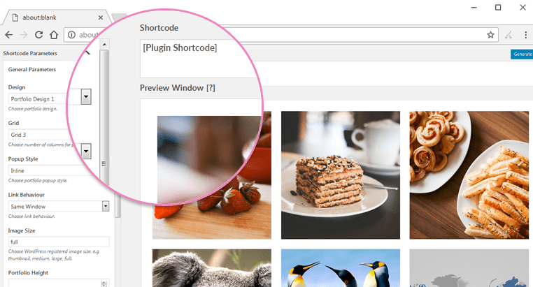
Shortcode Builder
Check the Result of any Shortcode with Preview using “Shortcode Builder“
Please Go To Admin Menu -> Album Gallery Pro -> Shortcode Builder.

Template Structure + Overriding templates via a theme
The template files of album and image gallery plus lightbox pro contain the markup and template structure for the front-end of your site. If you open these files you’ll notice they all contain many hooks which will allow you to add / move content without having to edit the template files themselves. This method protects even further against any upgrade issues as the template files can be left completely untouched.
Alternatively, you can edit these files in an upgrade safe way through overrides. Simply copy it into a directory within your theme named /album-and-image-gallery-plus-lightbox-pro, keeping the same file structure.
The copied file will now override the album and image gallery plus lightbox pro default template file. Do not edit these files within the core plugin itself as they are overwritten during the upgrade process and any customizations will be lost.
The following template files can be found within the /album-and-image-gallery-plus-lightbox-pro/templates/ directory:
-
Click Here To See Template Hierarchy
- album
- designs
- design-1.php to design-17.php
- grid
- loop-start.php
- loop-end.php
- slider
- loop-start.php
- loop-end.php
- gallery
- designs
- design-1.php to design-15.php
- grid
- loop-start.php
- loop-end.php
- slider
- loop-start.php
- loop-end.php
Image Album with Custom Order
You can display Image Album in custom order with Drag & Drop interface.
Click on Sort Gallery link on Image gallery’s listing page, Drag gallery row and click the ‘Save Sort Order’ button to save.

Quick Links
Plugin Installation
How to Activate License Key and Update
Plugin not Updating – Getting an Error Unauthorized