Getting Started
Album and Image Gallery Plus Lightbox adds a Menu tab in WP Admin side with the name “Album Gallery” where you can add new Image Gallery, Albums and etc. You can perform actions like edit and delete too.
Screen shows “Album Gallery” tab in the left side and All Image Gallery added

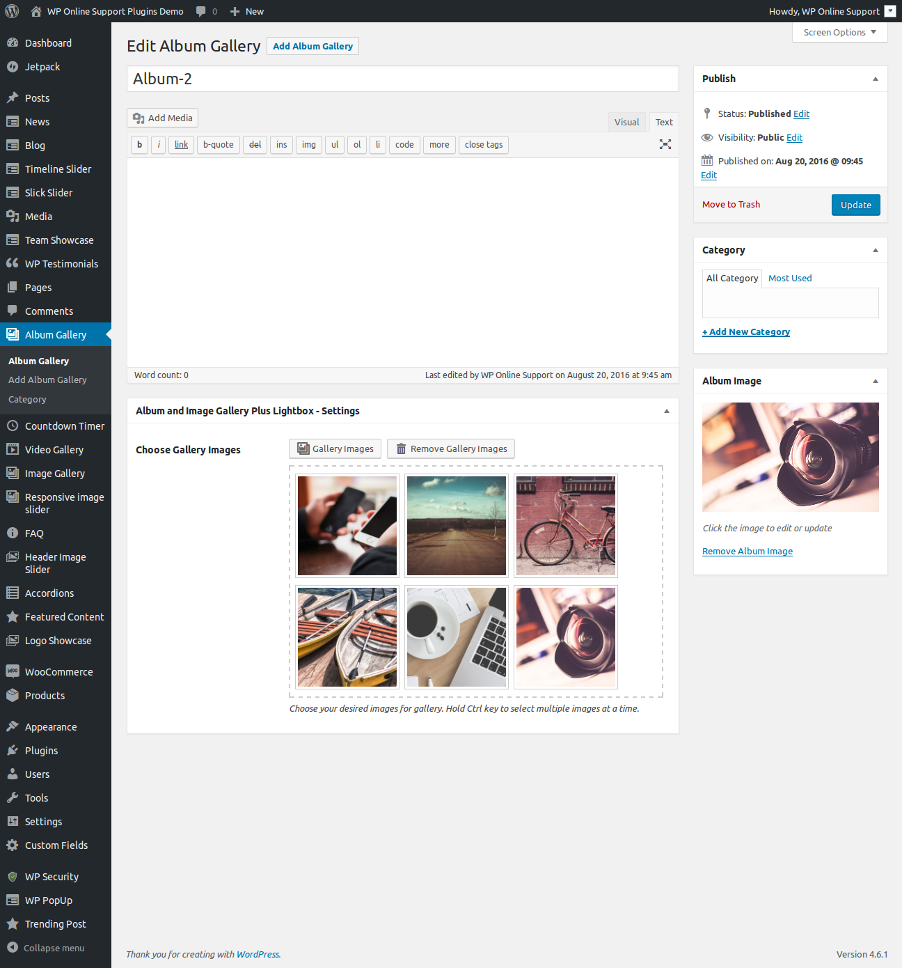
This plugin work same like WordPress post section where you can add title and featured image as album image. To add a new Image Gallery in plugin just need to follow few steps.
- Go to Album Gallery Tab and click on Add New
- Add Album title, Add Album description, Add Gallery Images, Add Gallery Title, Add Gallery description and update
- If you want to display category wise then go to Album Gallery -> Category and create a category
- When you create a Album Gallery post, select the category for that post
Bellow screen shows how to add a Album Gallery
If you want to display category wise then go to Album Gallery -> Category and select the shortcode.
Bellow screen show category shortcode


How to Display and Shortcode
Display a Album and Image Gallery is very simple. Just add the following shortcode on any page to display Album and Image Gallery.
Album and Image Gallery Plus Lightbox contains four shortcode.
[aigpl-gallery]
[aigpl-gallery-slider]
[aigpl-gallery-album]
[aigpl-gallery-album-slider]
<?php echo do_shortcode('[aigpl-gallery]'); ?> <?php echo do_shortcode('[aigpl-gallery-slider]'); ?> <?php echo do_shortcode('[aigpl-gallery-album]'); ?> <?php echo do_shortcode('[aigpl-gallery-album-slider]'); ?> Parameters for Image Gallery Grid
-
SPECIFIC GALLERY ID:
[aigpl-gallery id="5,9"]
Display Gallery image by specific id. You can pass multiple ids by comma separated. -
GRID:
[aigpl-gallery grid="1"]
Display gallery image in column wise. -
LINK TARGET:
[aigpl-gallery link_target="self"]
You can open a link in new tab or not. Values are “self” OR “blank”. -
GALLERY HEIGHT:
[aigpl-gallery gallery_height="400"]
Control height of the image. You can set “auto” for auto height. -
DISPLAY TITLE:
[aigpl-gallery show_title="true"]
Display image gallery title. Values are “true” OR “false”. -
DISPLAY DESCRIPTION:
[aigpl-gallery show_description="true"]
Display image gallery description. Values are “true” OR “false”. -
DISPLAY CAPTION:
[aigpl-gallery show_caption="true"]
Display image caption. Values are “true” OR “false”. -
IMAGE SIZE:
[aigpl-gallery image_size="full"]
Set image size. Values are “full”, “medium”, “large” OR “thumbnail”. -
POPUP:
[aigpl-gallery popup="true"]
Display gallery image in a popup. Values are “true” OR “false”. -
EXTRA CLASS:
[aigpl-gallery extra_class=""]
You can add extra class here.
Note: Extra class added as parent so using extra class you customize your design.
Parameters for Image Album Grid
- Limit:
[aigpl-gallery-album limit="10"]
Display number of album. To display all album pass limit=”-1″. - Link Target:
[aigpl-gallery-album album_link_target="self"]
You can open a link in new tab or not. Values are “self” OR “blank”. - Album Grid:
[aigpl-gallery-album album_grid="3"]
Display album column or grid wise. - Album Height:
[aigpl-gallery-album album_height="400"]
Control height of the album. You can enter any numeric number. - Album Title:
[aigpl-gallery-album album_title="true"]
Display album title. Values are “true” or “false”. - Album Description:
[aigpl-gallery-album album_description="true"]
Display album description. Values are “true” or “false”. - Album Full Content:
[aigpl-gallery-album album_full_content="true"]
Display album full description. Values are “true” or “false”. - Content Words Limit:
[aigpl-gallery-album words_limit="40"]
Set content words limit for album description. - Content Tail (Continue Reading):
[aigpl-gallery-album content_tail="..."]
Display three dots as a continuous reading. - Display Specific Album:
[aigpl-gallery-album id="5,10"]
Display gallery album by specific id wise. You can pass multiple ids by comma separated. - Display By Category:
[aigpl-gallery-album category="category_id"]
Display album by specific category ID. You can pass multiple ids by comma separated. - Total Photo Label:
[aigpl-gallery-album total_photo="{total} Photos"]
Control photo count label. “{total}” will replace the number of album photos. - Grid:
[aigpl-gallery-album grid="1"]
Display image gallery in column and grid wise. Values are 1 to 12. - Gallery Height:
[aigpl-gallery-album gallery_height="400"]
Set image gallery height. You can set “auto” for auto height. - Display Caption:
[aigpl-gallery-album show_caption="true"]
Display image caption. Values are “true” OR “false”. - Display Title:
[aigpl-gallery-album show_title="true"]
Display image title. Values are “true” OR “false”. - Display Description:
[aigpl-gallery-album show_description="true"]
Display image description. Values are “true” OR “false”. - Popup:
[aigpl-gallery-album popup="true"]
Display gallery image in a popup. Values are “true” OR “false”. - Image Size:
[aigpl-gallery-album image_size="full"]
Set image size. Values are “full”, “medium”, “large” OR “thumbnail”. - Link Target:
[aigpl-gallery-album link_target="self"]
You can open a link in new tab or not. Values are “self” OR “blank”. - Extra Class
[aigpl-gallery-album extra_class=""]
You can add extra class here.
Note: Extra class added as parent so using extra class you customize your design.
Parameters for Image Gallery Slider
- Display Specific Gallery:
[aigpl-gallery-slider id="5,9"]
Display gallery slider by specific id wise. You can pass multiple ids by comma separated. - Link Target:
[aigpl-gallery-slider link_target="self"]
You can open link in new tab or not. Values are “self” OR “blank”. - Gallery Height:
[aigpl-gallery-slider gallery_height="400"]
Set gallery image height. - Display Title:
[aigpl-gallery-slider show_title="true"]
Display gallery image title. Values are “true” OR “false”. - Display Description:
[aigpl-gallery-slider show_description="true"]
Display gallery image description. Values are “true” OR “false”. - Display Caption:
[aigpl-gallery-slider show_caption="true"]
Display gallery image caption. Values are “true” OR “false”. - Image Size:
[aigpl-gallery-slider image_size="full"]
Set gallery image size. Values are “full”, “medium”, “large” OR “thumbnail”. - Popup:
[aigpl-gallery-slider popup="true"]
Open gallery image in a popup. Values are “true” OR “false”. - Slider Columns:
[aigpl-gallery-slider slidestoshow="2"]
Display gallery slider in column or grid view. - Slides to Scroll:
[aigpl-gallery-slider slidestoscroll="2"]
Scroll number of images at a time. - Dots and Arrows:
[aigpl-gallery-slider dots="true" arrows="true"]
Display slider arrows and dots. Values are “true” OR “false”. - Autoplay:
[aigpl-gallery-slider autoplay="true"]
Start slider automatically. Values are “true” OR “false”. - Autoplay Interval:
[aigpl-gallery-slider autoplay_interval="3000"]
Delay between two slides. - Slider Speed:
[aigpl-gallery-slider speed="300"]
Set slider speed. - Loop:
[aigpl-gallery-slider loop="true"]
Display slider in Loop wise. Values are “true” OR “false”. - Slider Lazyload
[aigpl-gallery-slider lazyload=""]
Select option to use lazy loading in slider. Values are “ondemand”, “progressive”. - Extra Class
[aigpl-gallery-slider extra_class=""]
You can add extra class here.
Note: Extra class added as parent. so using extra class you can customize your design.
Parameters for Image Album Slider
- Limit:
[aigpl-gallery-album-slider limit="10"]
Display number of album. To display all logos pass limit=”-1″. - Link Target:
[aigpl-gallery-album-slider album_link_target="self"]
You can open album link in new tab or not. Values are “self” OR “blank”. - Album Height:
[aigpl-gallery-album-slider album_height="400"]
Set gallery album height. - Album Title:
[aigpl-gallery-album-slider album_title="true"]
Display gallery album title. Values are “true” or “false”. - Album Description:
[aigpl-gallery-album-slider album_description="true"]
Display gallery album description. Values are “true” or “false”. - Album Full Content:
[aigpl-gallery-album-slider album_full_content="true"]
Display gallery album full description. Values are “true” or “false”. - Slider Columns:
[aigpl-gallery-album-slider album_slidestoshow="2"]
Display gallery album in columns or grid view. - Slides to Scroll:
[aigpl-gallery-album-slider album_slidestoscroll="2"]
Scroll number of images at a time for album. - Slider Dots and Arrows:
[aigpl-gallery-album-slider album_dots="true" album_arrows="true"]
Display album slider arrows and dots. Values are “true” OR “false”. - Autoplay:
[aigpl-gallery-album-slider album_autoplay="true"]
Start slider automatically. Values are “true” OR “false”. - Autoplay Interval:
[aigpl-gallery-album-slider album_autoplay_interval="3000"]
Delay between two slides. - Slider Speed:
[aigpl-gallery-album-slider album_speed="300"]
Set speed for album slider. - Content Words Limit:
[aigpl-gallery-album-slider words_limit="40"]
Set album descrption word limit. - Content Tail (Continue Reading):
[aigpl-gallery-album-slider content_tail="..."]
Display three dots as a continuous reading. - Display Specific Album:
[aigpl-gallery-album-slider id="5,10"]
Display album by specific ID wise. You can pass multiple ids by comma separated. - Display By Category:
[aigpl-gallery-album-slider category="category_id"]
Display album by specific category ID. You can pass multiple ids by comma separated. - Total Photo Label:
[aigpl-gallery-album-slider total_photo="{total} Photos"]
Control photo count label. “{total}” will replace the number of album photos. - Grid:
[aigpl-gallery-album-slider grid="1"]
Display gallery image in column or grid view. - Gallery Height:
[aigpl-gallery-album-slider gallery_height="400"]
Set gallery image height. You can set “auto” for auto height. - Display Caption:
[aigpl-gallery-album-slider show_caption="true"]
Display image caption. Values are “true” OR “false”. - Display Title:
[aigpl-gallery-album-slider show_title="true"]
Display image title. Values are “true” OR “false”. - Display Description:
[aigpl-gallery-album-slider show_description="true"]
Display image description. Values are “true” OR “false”. - Popup:
[aigpl-gallery-album-slider popup="true"]
Open gallery image in a popup. Values are “true” OR “false”. - Image Size:
[aigpl-gallery-album-slider image_size="full"]
Set image size. Values are “full”, “medium”, “large” OR “thumbnail”. - Image Link Target:
[aigpl-gallery-album-slider link_target="self"]
Open gallery image link in same tab or new tab. Values are “self” OR “blank”. - Loop:
[aigpl-gallery-album-slider loop="true"]
Display slider in Loop OR not : You can use “true” OR “false”. - Slider Lazyload
[aigpl-gallery-album-slider lazyload=""]
Select option to use lazy loading in slider. Values are “ondemand”, “progressive”. - Extra Class
[aigpl-gallery-album-slider extra_class=""]
You can add extra class here.
Note: Extra class added as parent so using extra class you customize your design.